Tierra
Built on solid ground
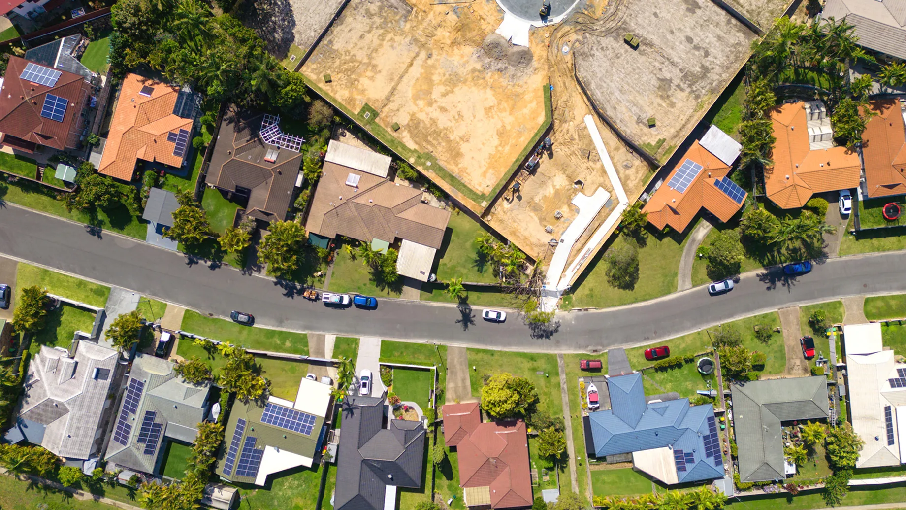
When the leadership team behind Tierra approached us, they didn’t need help finding their purpose. With thirty years of civil engineering and development experience behind them, they had a clear vision: to create vibrant, lasting communities across Southeast Queensland while addressing Australia’s critical housing shortage. What they needed was a partner to translate that clarity into a brand identity that could stand apart in a market dominated by functional sales-speak and corporate sameness.
The opportunity was rare: to help launch a new residential development group from the ground up, with strong leadership, a deeply held mission, and no legacy brand to untangle. Tierra already had its name, a word evoking earth, roots, and belonging.
The insight
The market was split between two extremes: large corporates with ESG credentials that felt obligatory rather than heartfelt, and smaller developers with no purpose beyond the transaction. Neither owned what Tierra could. The reassurance of a diversified group with the conviction of a founder-led business.
The idea
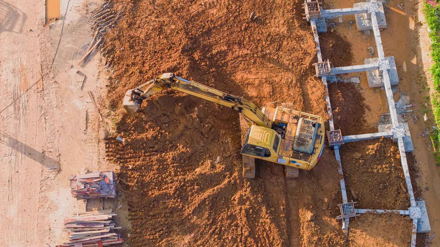
Champion a new approach to Australian housing: grounded in first principles thinking rather than industry convention. This wasn't corporate sustainability as checkbox; it was sustainability as genuine belief, backed by their own civil works capability. Helping Australians Thrive.
The creative
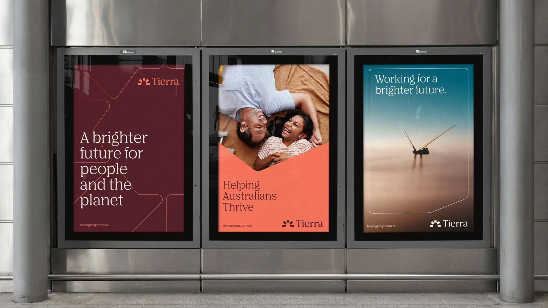
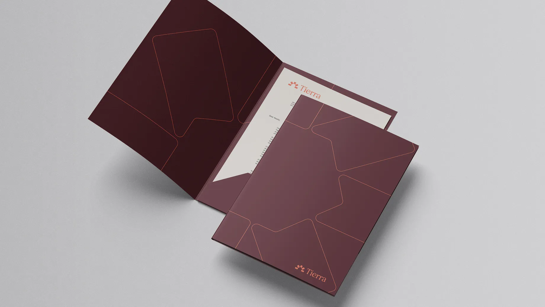
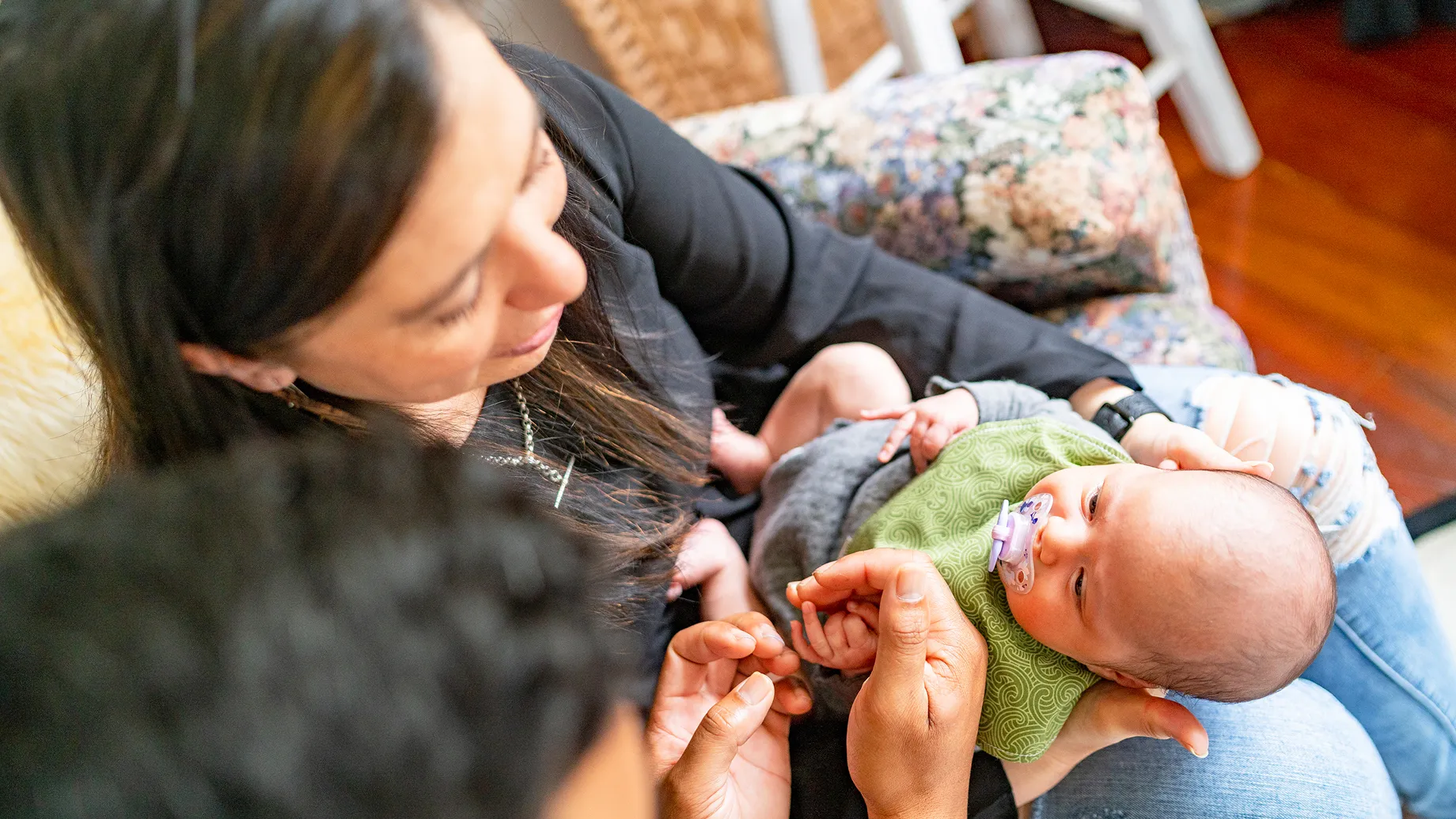
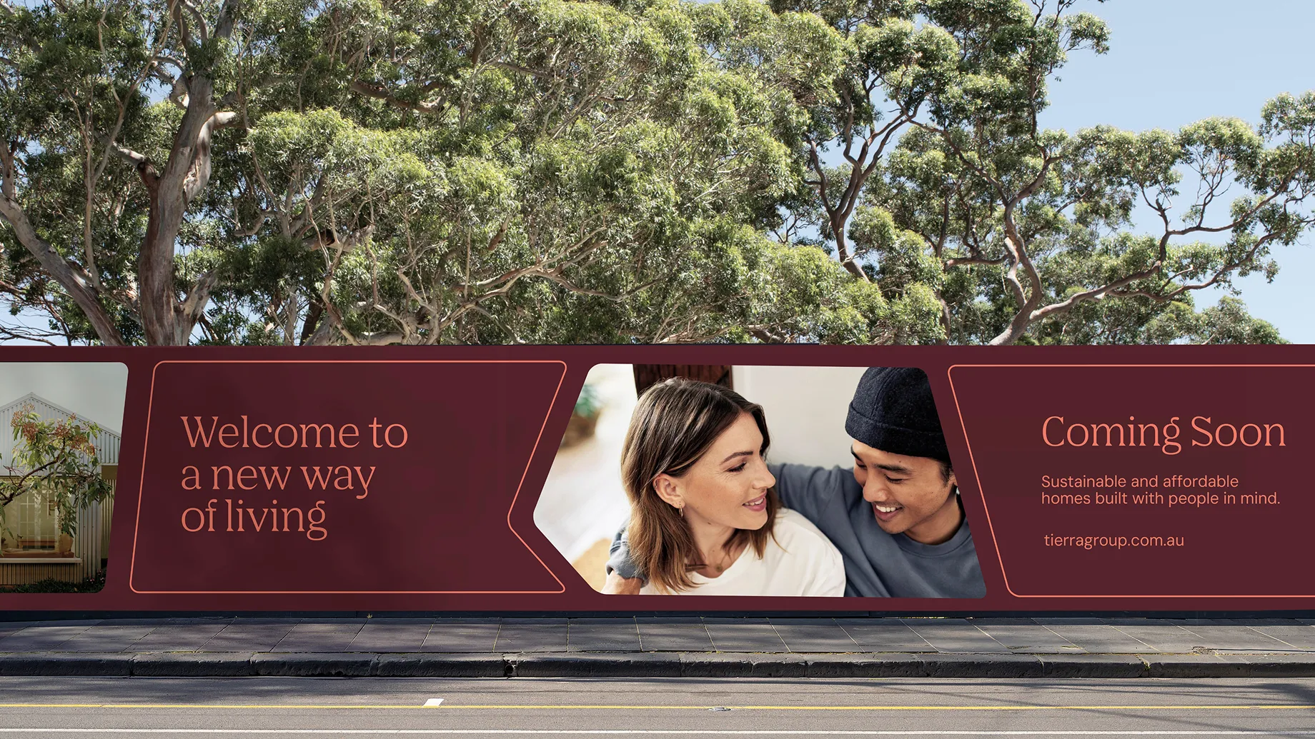
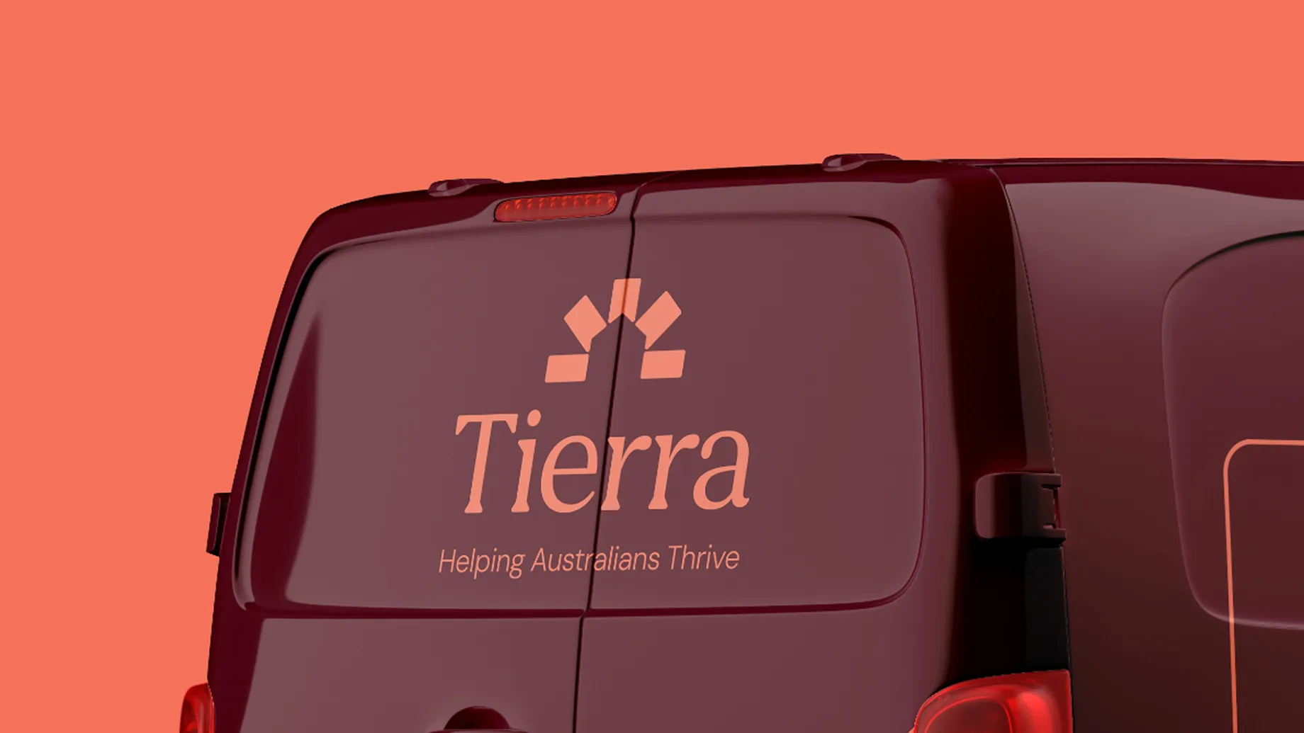
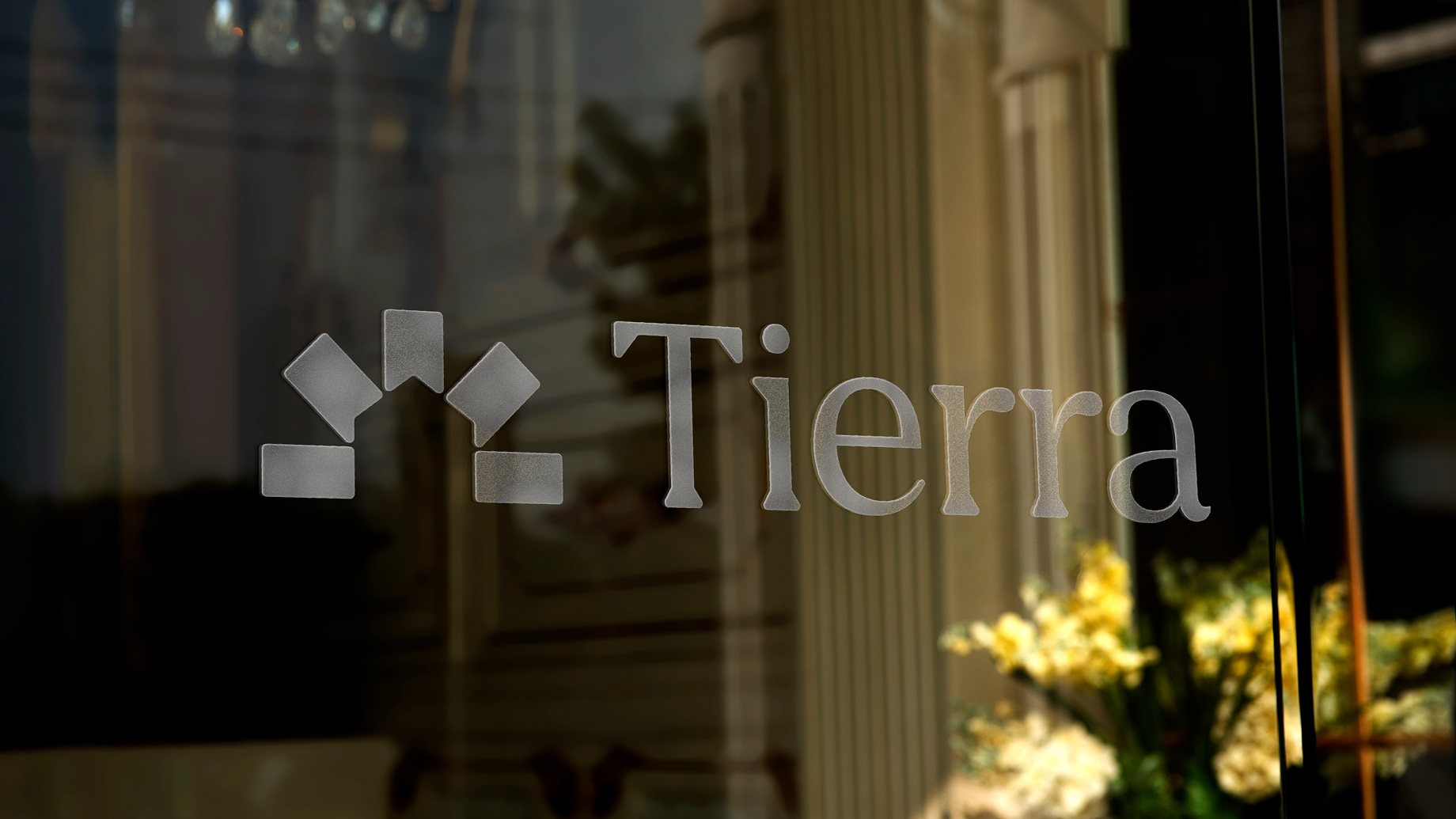
A brand world that feels calm, intelligent, and quietly confident. Deep burgundy and warm terracotta anchor the palette; a geometric symbol suggesting shelter and growth extends into a flexible brand device across applications. The voice avoids tired industry language. Progressive yet grounded, ambitious yet human.


Theola guided us seamlessly through brand discovery, crafted imagery, and delivered a website that perfectly reflects our vision. Their creativity, professionalism, and ability to translate ideas into a cohesive brand presence set the stage for our new land development business.
– Louise Yunker, Director at Tierra