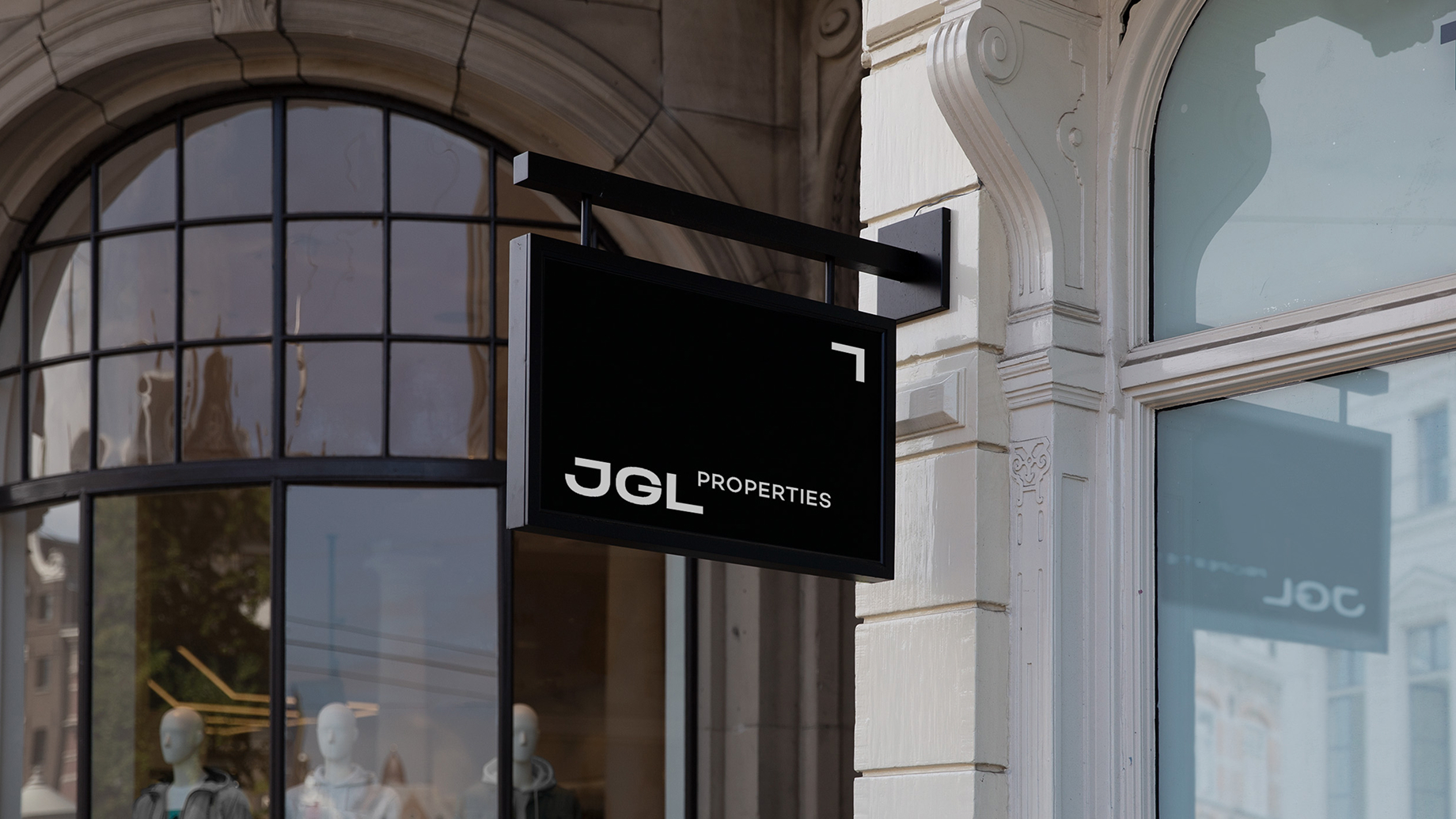
JGL Properties
Places made of character
JGL Properties had built a quiet but significant reputation in Brisbane, a developer defined not by scale, but by the quality of its relationships and the enduring character of its projects. With a portfolio spanning boutique residential to major commercial, and a vision anchored in building a better Brisbane for generations to come, JGL needed a brand identity that could speak with authority to architects, builders, consultants, and investors alike. The challenge was to move beyond project-by-project recognition and establish JGL as a cohesive, compelling corporate brand, one that reflected the intelligence and integrity behind its work.
Research pointed to a consistent truth: JGL’s point of difference was not a product attribute but a philosophy.
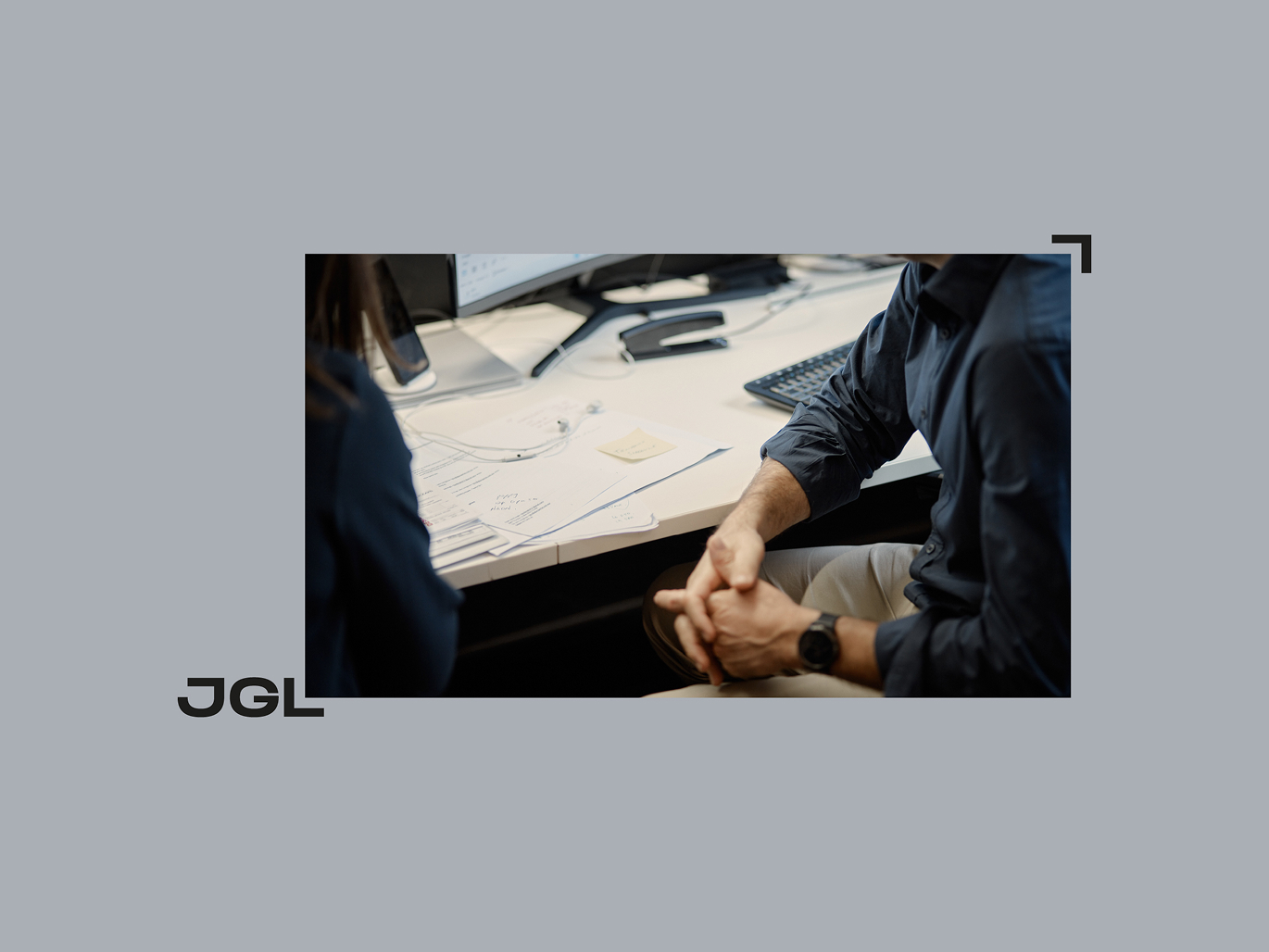
The insight
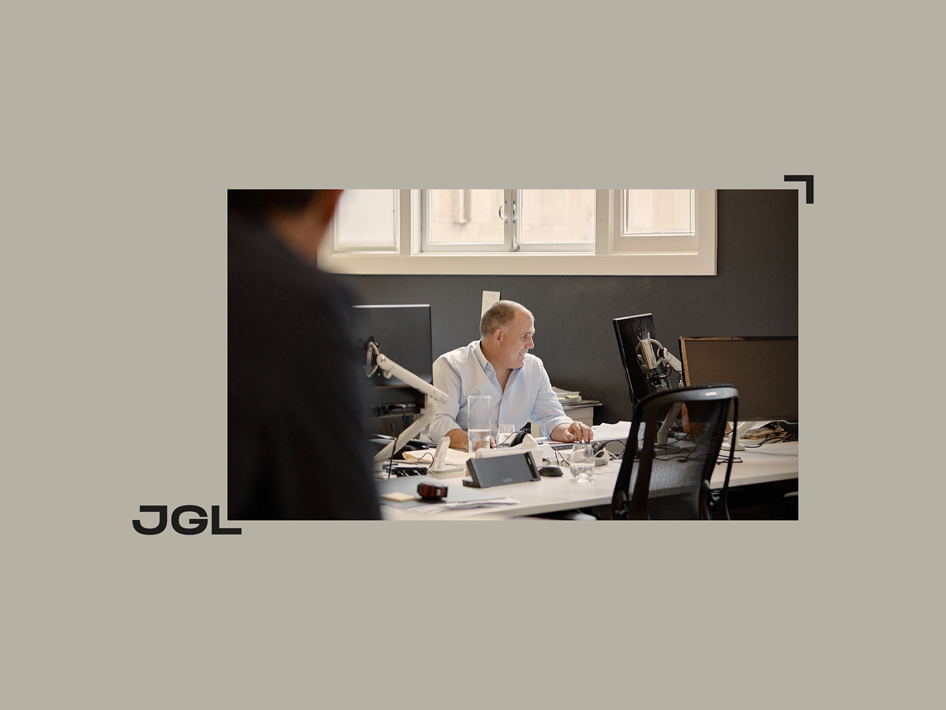
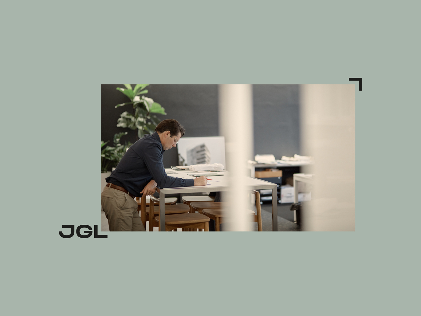
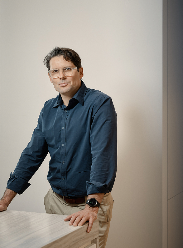
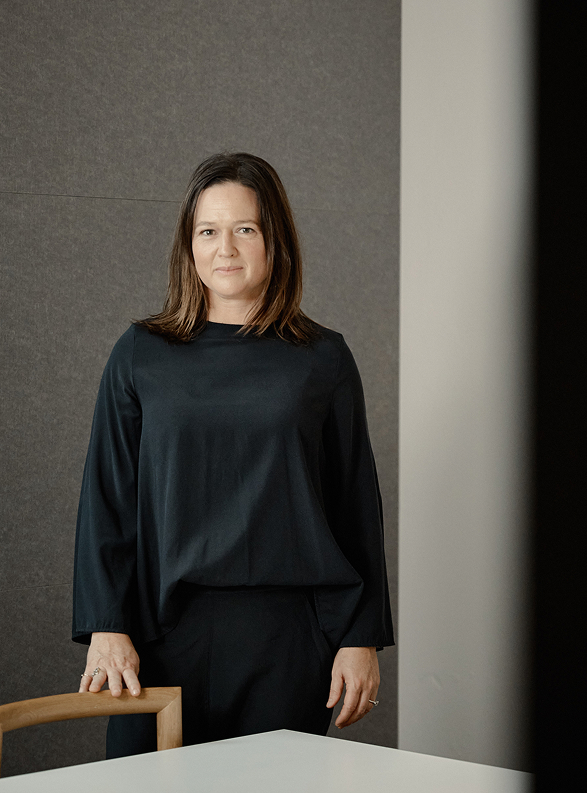
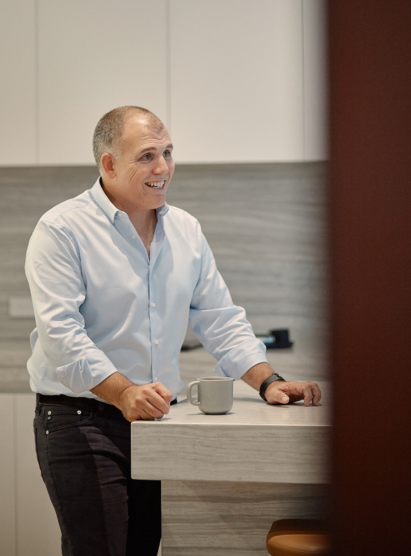
JGL's strongest asset wasn't a product, it was a way of working. Years of assembling brilliant collaborators, rewarding all stakeholders, and delivering with meticulous care had produced a track record of character-rich projects. The brand just needed to say so.

The idea
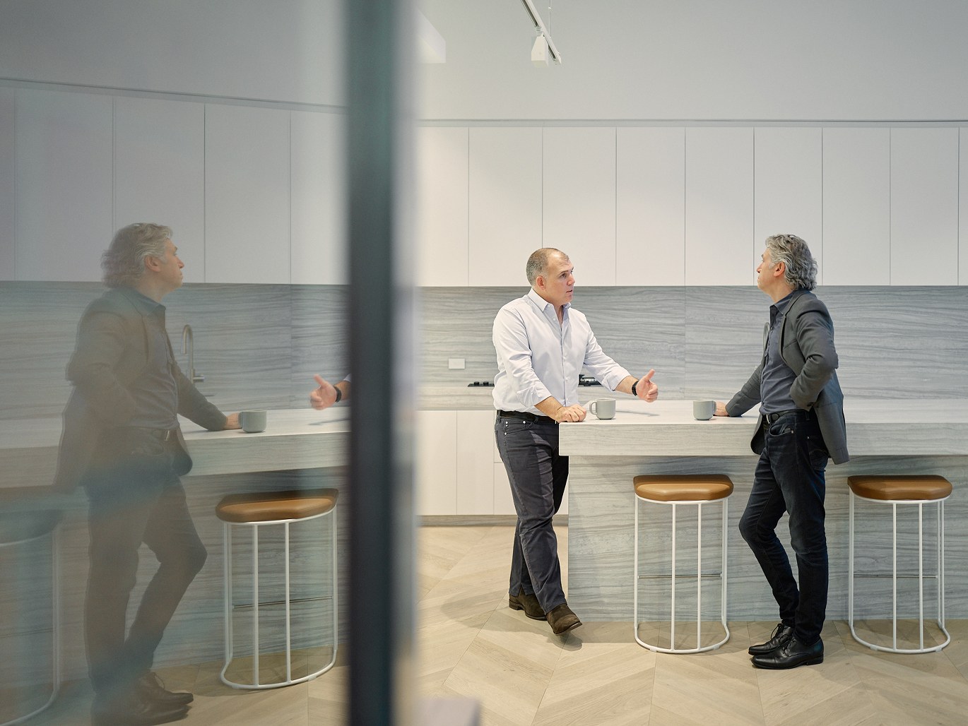
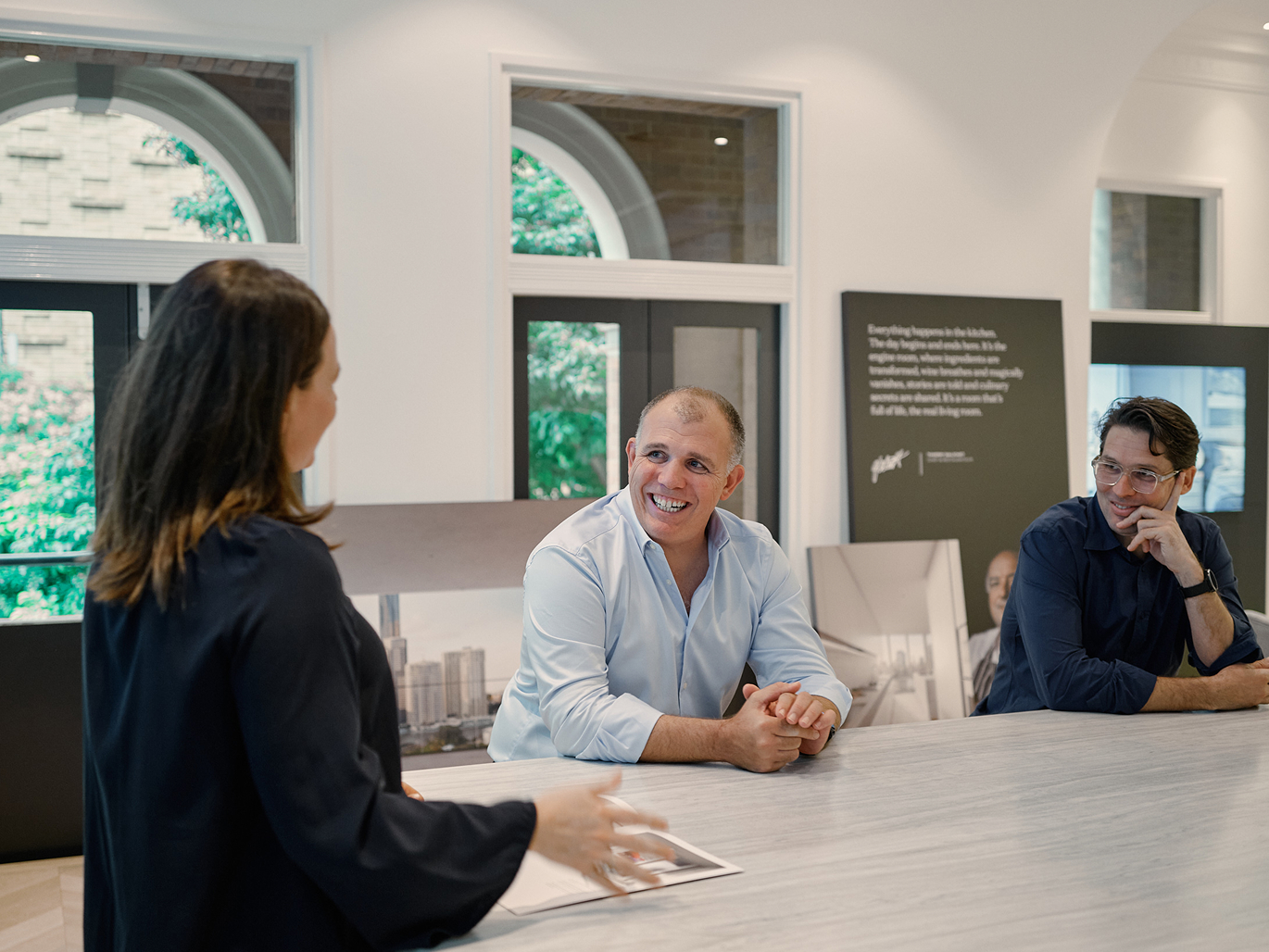
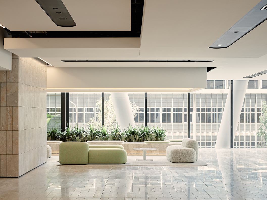
Places Made of Character positioned JGL at the intersection of people and place, honouring the relationships that make great buildings possible, and the buildings that make a better Brisbane inevitable. It gave the brand a legacy to speak to, not just a portfolio to show.
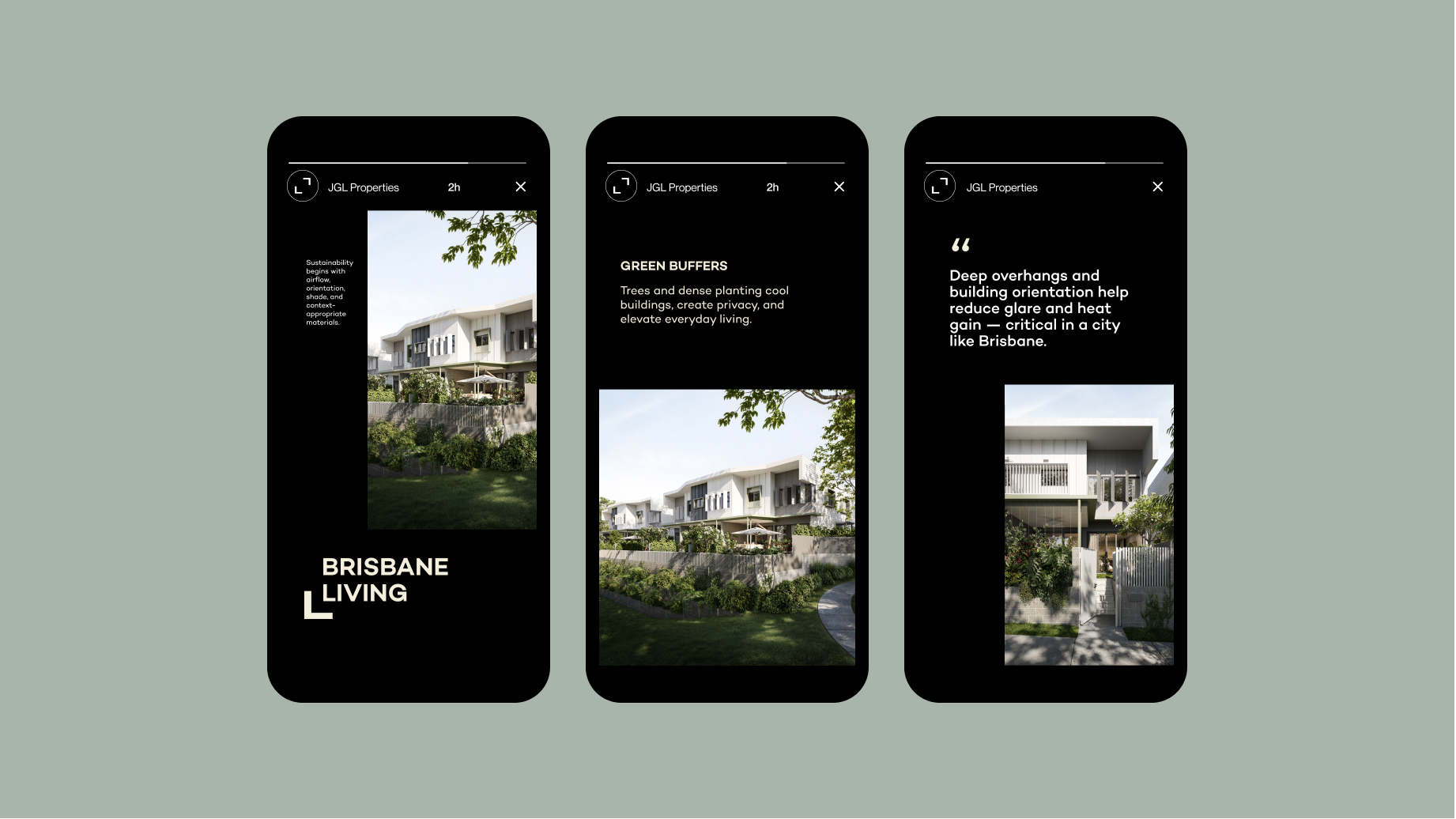
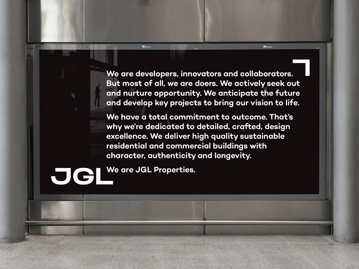
The creative approach
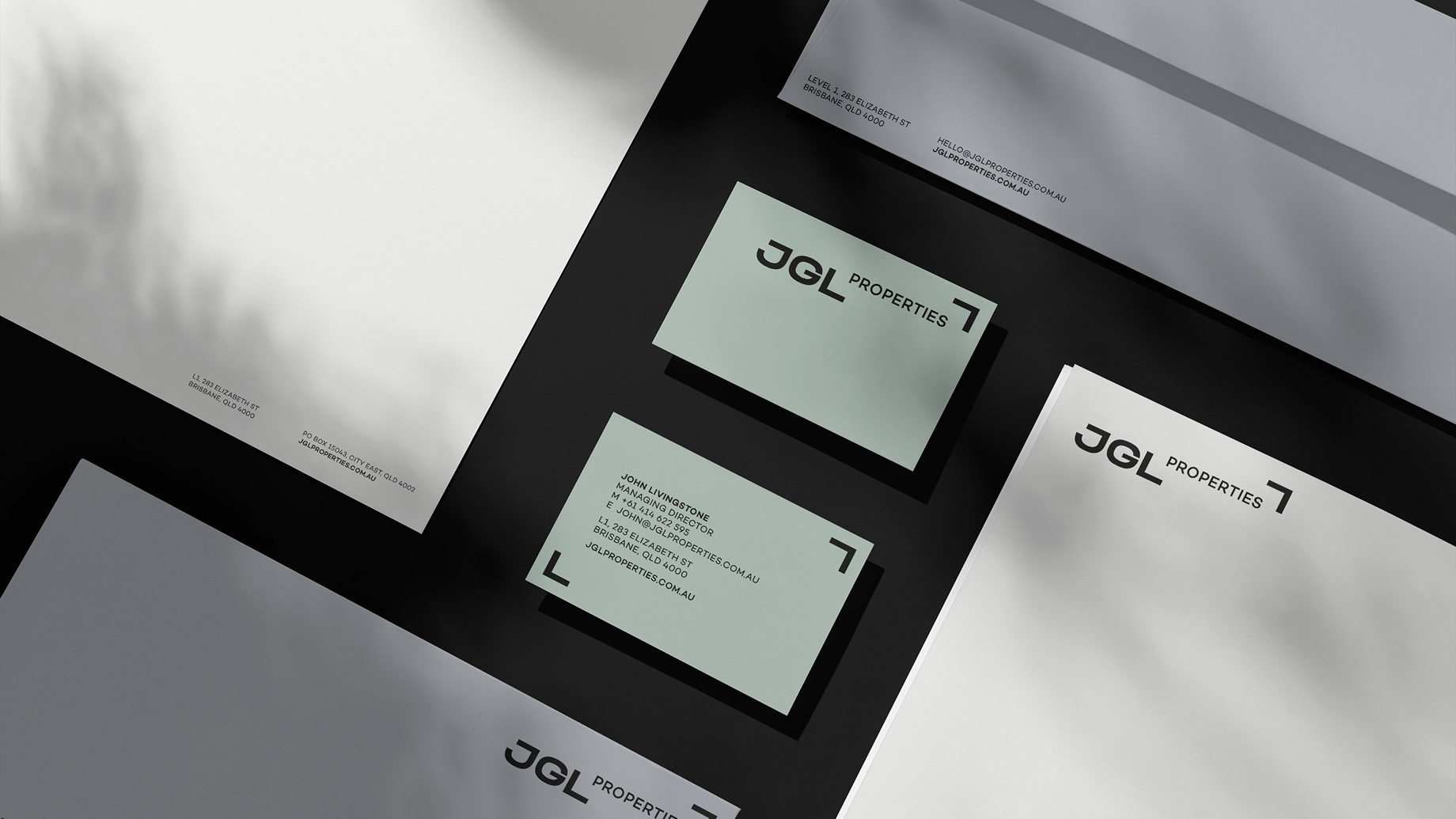
The monogram system transformed JGL's initials into architectural corner brackets, a device that frames imagery, anchors layouts, and references the built form at the heart of the business. Applied with restraint across every touchpoint, it gave a people-centred brand a quietly structural edge.